

После того, как все
приготовления окончены, запускаем программу SAI, открываем в ней свой PSD-файл, создаем пустой слой и заливаем его серым цветом. Помещаем
этот слой под слоем с персонажами:
After all the preparations are finished, run the SAI program, open our PSD file in it, create an empty layer and fill it with gray. Put this layer under the layer with the characters:
After all the preparations are finished, run the SAI program, open our PSD file in it, create an empty layer and fill it with gray. Put this layer under the layer with the characters:

Берем инструмент Ластик и стираем оставшуюся кайму вокруг
наших персонажей:
Take the Eraser tool and erase the remaining border around our characters:
Take the Eraser tool and erase the remaining border around our characters:

Это поможет избавиться от
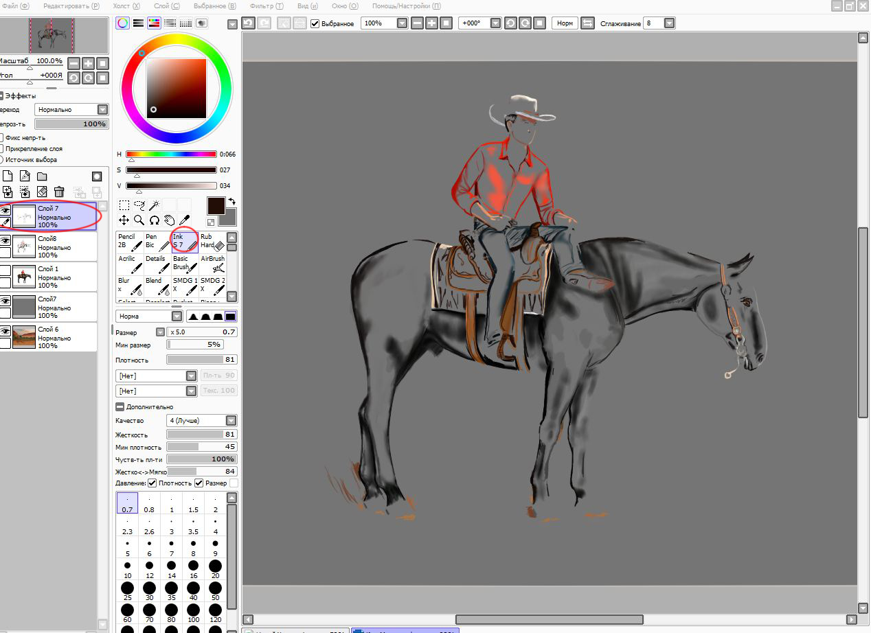
некрасивого «ореола» и пиксельных краев. Закончив с этим, создаем пустой слой
над слоем с персонажами, берем инструмент Ink и, варьируя его размер, начинаем отрисовывать края, добавляя
мелкие детали и скрывая мелкие недочеты. Так выглядит отрисовка с отключенным
нижним слоем:
This will help get rid of ugly "halo" and pixel edges. Having finished with this, create an empty layer above the layer with the characters, take the Ink tool and, varying its size, begin to draw the edges, adding small details and hiding small defects. So it looks like drawing with the bottom layer turned off:
In the process of rendering, we get rid of larger image defects, such as a broken horn pose, etc .:

Закончив с отрисовкой, я посмотрела на готовую композицию, и
она показалось мне слишком студийно-правильной и скучной. Чтобы сделать скрин
более живым и походим на фото, сделанное в повседневной жизни, я решила
добавить на передний план несколько коряг (клипарт в PNG формате не сложно отыскать в
интернете):
Having finished with the rendering, I looked at the finished composition, and it seemed too studio-correct and boring. To make the screen more vivid and resemble a photo taken in everyday life, I decided to add a few snags to the foreground (it's easy to find clipart in PNG format on the Internet):

Не забывайте добавлять падающую тень ко всем вклеенным
объектам! Это важно, так как иначе изображение станет нереалистичным. Так же
следует соблюдать направление тени – при помощи инструментов «Свободное
трансформирование» и «Перспектива», расположите тени в той же плоскости, что и
тень от игрового объекта.
Чтобы коряги не отвлекали внимание от центра композиции, я
применила к слою с ними фильтр Размытие по Гауссу:
Do not forget to add a drop shadow to all pasted objects! This is important, because otherwise the image becomes unrealistic. You should also follow the direction of the shadow - using the tools "Free Transform" and "Perspective", arrange the shadows in the same plane as the shadow from the game object.
To prevent snags from distracting attention from the center of the composition, I applied the Gaussian Blur filter to the layer with them:

Добавляем поводья. Я обычно рисую их при помощи
вектора, а затем применяю Стиль слоя – Тиснение. Кроме этого, для придания им
объема, следует сделать падающую тень. Копируем слой с поводьями, при помощи
Яркости-Контрастности делаем черным, помещаем под слой с поводьями, стираем
лишнюю часть и слегка размываем:
Add the reins. I usually draw them using a vector, and then apply the Layer Style - Stamping. In addition, to give them a volume, you should make a falling shadow. Copy the layer with the reins, with the help of Brightness-Contrast we make it black, place it under the layer with reins, erase the excess part and slightly blur:

Дорисовываем хвост и гриву,
смотрим, ничего ли не забыли, если забыли – исправляем, пока не слили слои)))
Готовый скрин:
We finish the tail and mane, look, do not forget anything, if forgotten - correct until the layers are merged)))
Ready Screen:
We finish the tail and mane, look, do not forget anything, if forgotten - correct until the layers are merged)))
Ready Screen:

You can play with filters Nik Collection and it's similar, to give the screen a suitable color scheme. On this all) I will be happy if this lesson to someone useful)
Комментариев нет:
Отправить комментарий